When a new feature ships, everyone wants it to look and feel just like the original design. But in reality, spacing shifts, fonts break, and interactions don’t always match what was planned. This is where design QA comes in.
Design QA is the process of checking that your live product matches the original design specs. It’s more than just “spotting bugs” — it’s about making sure the experience stays consistent with what the design team intended.
Without it, you risk:
In fast-moving product teams, QA can feel like a blocker. Designers are expected to trust the dev handoff, while PMs just want to get the release out. But skipping QA doesn’t actually save time — it pushes problems downstream, where they’re harder and more expensive to fix.
Good design QA doesn’t have to be a burden. Here are a few best practices we’ve seen work:
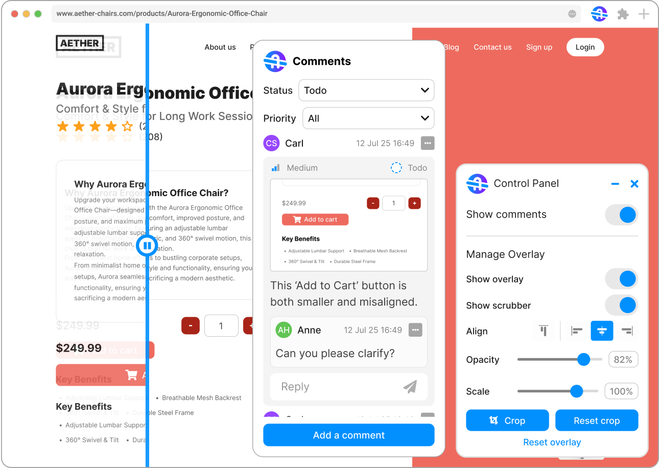
Test in context, not in isolation
Checking screenshots in Figma isn’t enough. Review your design on the live site where spacing, typography, and responsiveness matter most.
Centralize your feedback
Don’t spread comments across Slack, Jira, and random docs. Keep everything tied to the page or component you’re reviewing.
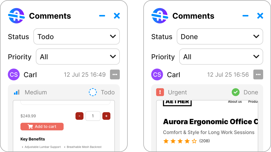
Prioritize issues
Not every mismatch is critical. Label feedback by priority (Low, Medium, High, Urgent) so developers know what to fix first.
Make QA collaborative
PMs, devs, and designers should all be able to contribute feedback. QA isn’t just a “designer’s job” — it’s a shared responsibility for the product team.
The best teams don’t treat QA as an afterthought. They build it into their workflow so issues get caught early, feedback is never lost, and everyone has clarity on what’s done vs. what’s still open.
That’s the shift we’re working toward at BridgeQA — making design QA fast, collaborative, and part of the natural flow of building products.